Thursday, 29 December 2011

Animation: equipment test1


A quick and dirty job to test how my camera is behaving with DragonFrame. I don't have any lights on the set yet so the image quality is pretty grainy (long 2 seconds exposure shots with ISO settings maxed out). 

Besides, I think I managed to cram all the "not to do's" in those 4 seconds: 

* Bad focus 
* Flickers (will need to buy a power stabilizer for the lamps) 
* Dropped my ugly shadow on the set in a few frames
* The puppet was not properly tied resulting in a rather jerky animation 
* Bumped the camera a few times and had to approximately re-align (here the "onion skin" feature of DragonFrame was handy) 
* No plan whatsoever
* No timing
* worked without any dope-sheet resulting in moments like: err... in which direction is that leg is supposed to move, again? 

But god was it fun!

Tuesday, 27 December 2011

Set Building : Sofa and other details

This shot shows another new prop freshly added to the set. Other smaller details, such as the wall skirting and the door framing have been added.

Set Building: the filing cabinet

Manny's office has now a filing cabinet. I had this done by a local carpenter in Cambodia who still has no clue, even with my agitated explanations, about the final purpose of what I was asking him to build.

Of course, I would have liked more details, such has metal handle, and label frames... but hey... this is an amateur project and I don't have the resource of a professional stop-mo studio, so this will have to do if I want to finish this 3 minutes project within this century.

I might paint those handle with silver paint if I find a warhammer shop selling Citadel paints...
The most important feature which I am very happy about is the fully functional sixth column of filers which opens just like in the original movie.

This is another liliputian step in this long journey, and looking at this little props puts a silly static smile on my face for this whole evening, at least.

Oh... and I did a really, really, crappy 3-second animation test shot using my new camera and DragonFrame software. Which I will shamelessly publish in this blog... just for you to realize how far I am from becoming a stop-motion animator.

Wednesday, 21 December 2011

Puppet making: Chay's take on Celso's skull

Celso's CG 3D sculpt by Chay
Yesterday was my birthday, and incidentally I had a great gift awaiting in my inbox. Chay is a very talented graphic designer and a GF fan. Chay has apparently mastered a radically innovative 3D modelling software called zBrush which allows you to sculp model pretty much the same way you would with clay (adding matter, bloking out, smoothing, chiselling).
I approached him after seeing a great fan-art 3D rendition of Manny's character, and he generously accepted to help this project.
It's always embarrassing to ask an artist to deliver a work in the same style as another artist, but I wanted some design consistency with Manny's existing skull model and I sheepishly asked him if he could stay close to Tom Beg's own fan art rendition of Manny's skull.
I am really amazed by the model that he sent me, not only it is beautifully executed, but it also falls right in the stylistic "spot" which I was hoping for.
This GF-Fan community is amazing.

Monday, 12 December 2011

Set Building: Finishing the carpet


For Manny, every things always start with a good sweeping move. I think he got that carpet nailed, with the pattern and color of the carpet sufficiently close to the original to move on the next lilliputian step into this very slow-paced adventure...

Sunday, 11 December 2011

Investment: DragonFrame Software

Immediately after purchasing the Camera, I went to purchase the software which will be controlling it. DragonFrame, formelly known as Dragon Stop Motion before the release of version 3, is developed by Dzed, an amazing little software company that I would die to work for.

There were quite a few software occupying that space before them, but somehow, DragonFrame is taking it at the next level, leaving the competition far behind. It is remarkable to see a software company which vision seems to empower the lost art of (low tech) stop-motion, with the best tool-set that computer technology can offer.The angle of DragonFrame is resolutely contemporary : The stop mo craft has moved not long ago to DSLR Cameras, never to return, it seems, to former shot grabbing alternative (such as Digital Video Cameras). DragonFrame is designed from the ground up to harness the power, flexibility and high resolution of DSLR. Just USB-wire your DSLR camera software to your computer, turn on its "life-view" feature (a web-cam like video feed that DSLR camera is sending as "live preview" of the shots), start Dragon Frame... et voila... Plug'n Play at its best... the software takes over and control focus, ISO, aperture, shutter speed, executing shots and sending the pics directly on the your computer hard disk... it's magic.

The new version 3 is packed with so many tightly integrated features, too many to enumerate: take their Lip-Sync system for instance, which allow planning and synchronization of dialog with mouth movement (with replacement mouth or otherwise)... there is a dedicated software doing just that called Magpie which cost close to 500 USD. Well, in Dragon 3, this is just a side feature, part of the whole package which sells for 300 USD with the Keypad.

I actually don't quite understand how they can get away publishing such a specialty software, in the Pro league of this minute industry, for less than 300 USD. I wonder how their business model is working... there can't be so many of us pulling this kind of software off the shelve at 300 USD to maintain an apparently sophisticated software (and hardware!) company afloat. Why so cheap? Oh yeah... of course... their market is Stop Mo animators... the kinds that do not necessarily have deep pockets.

p.s Oh, and... did I mention... their website feature one of the most interesting and progressive blog about Stop Mo.

Set Building: those ceiling corners.

Another quick Sketchup work to deal with those art deco corners. These are more or less aligned to the  plaster decoration that runs on the top of the wall. Tricky to build... probably another job for my 3D printer.

Thursday, 8 December 2011

Set Building: surface texturing


So, time to dress up this beautiful naked wooden box...


First, the carpet. I found some blue fabrics of the right color in a snooker repair shop.
Then, applying some pins and string, I divided the surface equally to put some marks where the circles and squares will have to be painted on the carpet.


Printing over sticker paper and cutting the shape out, the stencil are applied at the intersection of the strings. The strings are then removed.


I am still testing different ways of painting over the stencils, I think I found the right way, but this will have to wait. First, let's apply some texture on the wall : I mentioned in an earlier post that I had designed some trash-dirt yellow texture. I sent my files to a print shop for printing over sticker-poster. The trick was simply to stick these poster over the wooden walls... trying to avoid any bubbles.


The walls look much brighter than they will look in the stop-mo shooting : I am using flash, while the stop mo shooting will be made with longer exposure with a more subdued light. I am rather happy by the result. I wanted some dirt to accumulate in the corners of the room and the texture seems to do the job.
 

The door and windows are still just a square holes in the wall, but they will eventually be dressed up.


Notice the column on the left? just like in the original set from the game.


Manny's feeling home, yet the painting of the carpet will be the next delicate step.

Sunday, 4 December 2011

Puppet Making: The making of replacement mouth

After careful consideration, Tob Beg's original 3D model, as great as it is, would not do the trick in its lower part for stop mo animation purpose. Even without the teeth, I could not find a way to convincingly model the mouth within its model. I took the decision to remove the lower part of his model, and to remodel a jaw/chin that would give me a little more breathing space for modeling my replacement mouth set.

10 units of this rather unimpressive piece of molded resin has were cast after an original jaw-chin shape that I did in clay to complement the now mutilated model shown in pic 1. Having 10 identical pieces like this will allow me (I hope) to make all my replacement mouth on the same baseline. If I am molding each replacement mouth separately, I am afraid that the shape will change too much from one shot to another while Manny's speaking, making the animation very jerky. OK, it might still be jerky in the end, but at least I made an effort to avoid it!
I am using SuperSculpey Firm. Not my choice, but because this is the only pro clay that I can find around. It does the trick, however. I simply roll a piece of Super Scupey flat so has to get a skin of about 1mm think.
That skin is used to wrap the jaw piece around.
It's really like wrapping a gift. The extra material is cut away with the hobby knife.
This outer-skin made of Sculpey will be our sculpting surface. Being one millimeter thick we can choose to either sculpt-in the existing layer, as shown above for the teeth...
... or add material on the skin to add details, such as shown above. No it's not a Mexican mustache, it's the beginning of the surrounding lips.

Now you see what I mean. I could have left the lips protubing like this, giving it a comical effect reminiscent of the animation Aardman Animations (Wallace & Grommit, Chicken run)
But instead I have opted for sinking the lips into the skin as shown above... hoping not to make a too wide departure from the original Manny, who, after all, had pretty flat mouth features!

Puppet Making: Mouth replacement set (1rst trial)

Here are a first set of (unpainted) replacement mouth for Manny. The learning curve is stiff, and I cannot say that I am fully satisfied with the result. But this will be good enough for doing some lips syncing test runs. I will probably re-do a better set for production purpose...

In a separate post, for those interested, will share the process in excruciating details. Hopefully some professional mouth replacement gods will drop by my blog and will point me toward the light. In the meantime, I will stubbornly hone my craft in the darkness.


Investment: Canon EOS 550D

This week-end I got an advance on my birthday + chrismas + New Year + Saint Valentin + Day of the fathers for the decade to come and just got this beauty... A canon 550D, with the wonders of stopmo animators: the LifeView feature which has virtually put hi-res stop mo within reach of amateurs... like me.

I was lucky to find a 2nd-hand-yet-looking-brand new box + lens for about 500 USD. With the savings from this bargain, I could convince my wife and nonetheless banker to get a tripod.

As an immediate benefit, I should be able to upload less crappy pictures on this blog, which has been subjected to all sort of mobile-phone grainy pictures.

While we are still month away from any proper photo shooting sessions (lots of stuff remains to be done in set-building and puppet-making), I intend to put my canon at best use for running tests with Dragon Frame software. Would be nice to have a set of replacement mouth for Manny now...

Sunday, 27 November 2011

Set Building: Manny's chair... tangible

 Here is Manny's chair! In its first rough delivery. Note that the original in the game had 6 legs. But that's easier to model in 3D than to weld!

As for the guest's chair, that one will be properly dressed with red fabrics over some polyurethane mousse, and a tiny paint job before it gets into the shot.

Set building: The guest's chair

Here is the chair... or rather its "bare-bone" structure. It will be eventually dressed up with red padded fabrics like the original. The back of the chair is not as oval as the original, but it will have to do!

Set Building: Manny's desk in the material world


There is something immensely satisfying in being able to touch anything that comes from Grim Fandango. Here is my first prop... the desk. Pretty close to the mark, but of course the model has not been painted yet.

Sunday, 20 November 2011

Puppet Making: Celso's armature proportions

After yesterday's "Usual Suspects" lineup, here is the adapted armature for Celso. Same height as Manny, different body shape.


Saturday, 19 November 2011

Set Building: Grunging it a bit

Back to set-building... Right now Manny's Office set is pretty much a naked wooden structure. First, I will need to add texture to the wall, ceiling and floors, before my miniature props (furnitures, accessories) settles in.

I want the Manny's office to be as gloomy as the original, but with more details. His office is a reconverted storage room. It is the office of a looser, set in a dark, moist corner of the DOD building. I have therefore opted for preparing a vintage-grungy wallpaper in Photoshop, which I will print as a poster and apply along the walls. I want the corner of the room to be already shadowed by the texture to facilitate the actual lightning contrast of the set.

For those interested in the photoshop technique, I have used this tutorial together with this paper texture and some pretty wicked photoshop "Grunge Brush" available on DeviantArt.

The actual wall paper is one meter long, but here is a snapshot...


Puppet Making: Early tackle on Celso

"Do you recognize any of these skeletons Ma'am?"
The day-job has been in the way lately. But the project keeps moving slowly and surely : The set needs to be dressed up and some materials have already been identified. I am thinking of using some snooker-table type of textile to emulate the dark blue carpet in the office, while doing the walls by simply pritting out a pre-shadowed wall texture on cardboard paper and gluing the sheets it to the wall, like a normal wall-paper.


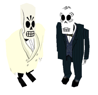
I have also started to think about Celso Flores, a minor character of the game, but who is the main dialog partner of Manny during the intro-movie that we want to re-create.  While both Manny and Celso are about the same height, Celso is much more anatomically correct than Manny (yet far less alluring!), with higher pelvis, shoulder, and a far less elongated skull. This difference of body shape will affect the armature design , which will soon follow.


Saturday, 12 November 2011

Set Buidling: Decoration Details

What makes GF so stylish is the seamless blend between art-deco, film-noir and mexican-mayan graphic style which permeate from almost any scene. Tim and its designer team nailed down a very unique, and consistent, style throughout the the Wold of the Dead.
Manny's office borrows from a typical 50's bulky style. It is supposed to be a less-than-glamorous office - actually, as we learn from the script, a reconverted storage room - since Domino managed to get the favors of the boss Don Copal, hence taking over Manny's former stylish office.


The set will have to carry these dark, dull colors, and the unenviable spot in which Manny has been cornered. Yet, a few decorative elements can be noticed. Here are the sketchup 3D rendition of 2 plaster decoration that can me see on the top of the walls and on the ceiling.